Introduction
One of the greatest joys, when you start in Flutter is this freedom to be able to modify the display as you develop. This allows us to test, to respond in real-time to customer requests, to see in real-time what something might look like... and once the screen or the component we are working on satisfies us, we move on to the next one and so on.
On some screens, we will like to have a title in blue, bold and italic with a size of 28 while on another screen, we will define a size of 26, but not in italic and why not in dark green. I am sure that you see what I'm talking about...
Flutter provides a class you probably know, called TextStyle, which allows you to define the style of a text to be displayed using the Text widget.
Uncontrolled use of this class often leads to the following problems:
lack of harmony
The styles differ from one screen to another, from one component to another...
maintainability problems
Having dozens of styles defined throughout your application will make any modification requested by your customers very laborious.
After a while, we tell ourselves that with the next application, we will do better. So, we start to create a class that will contain the list of text styles and give them a name. Everything is going very well and, very conscientiously, at the start of the application, we limit ourselves to the styles that we have defined but often, sooner or later, we start to create more and more, and even if we force ourselves to only use these styles, again, our app loses its harmony. This is especially true when you reuse Widgets that you have created from one application to another ...
Who has not been confronted with this?
On the other hand, we know that there is a notion of Theme in Flutter. We take a look at it but at the beginning, we wonder how to use it and we think that we will not be able to get everything by limiting ourselves to it.
Long introduction ...
The purpose of this article is to
- demystify this notion of TextTheme
- to explain where and when, by whom they are used (you will find an Excel file which makes an inventory of their use)
- how to reuse them in your own code
- how and under what conditions to modify them locally
- how to define your own styles in a controlled manner.
Background information
Before going into the details, let's maybe first introduce some basic notions, which will be used later in this article.
Terminology
Please refer to this article for a more complete explanation related to Typography.
Glyphs
In typography, a glyph is an elemental symbol within an agreed set of symbols, intended to represent a readable character for the purpose of writing (ref: wikipedia).
In very simple words, a glyph is a character (a, b, D, W...), a figure (0, 1, 2...), a punctuation (; ! .), a symbol ($ £ @) ... a single piece of a text to display on your screen.
Font
In our IT world, a Font could be understood as a digital file containing the definition of a set of graphically related glyphs with specific size, weight and style. It defines the shape, size and graphics of each of its glyphs.
Font Size
The font size is expressed in logical pixels (Android: sp, iOS: pt, Web: rem) and defines the size of the glyphs.
Please note that there is no conversion ratio between 'sp' (Android) and 'pt' (iOS), while there is a conversion ratio for the Web. This conversion ratio is 0.0625. As an example, a fontSize of 10sp (Android) will be 10pt (iOS) and 0.625rem (Web).
In Flutter, the default font size is set to 14.
A same value of font size can give different layouts, depending on the font being used!
Each font defines its own reference size, called 'em', based on which each glyph is designed.
As a consequence, it is not unusual to have a different layout using 2 different fonts, even setting the same font size!
For more information related to this, check out this article.
Baseline
The baseline is an invisible line upon which a line of text rests. To visualize what is the baseline, consider a copybook you used at school and you have to write your text, taking a horizontal line as a reference to draw your letters. The baseline is that horizontal reference line of your copybook.
The baseline is a very important notion in Material Design, as it is used to measure the vertical distance between text and an element.
Letter-Spacing
The letter-spacing refers to the space to insert between each letter (glyph) in a piece of text.
Weight
The weight refers to the thickness of the font's stroke. Common weights are:
- light
- regular
- medium
- bold
However, there might exist additional ones and Flutter defines the following ones:
- FontWeight.w100 (the least thick)
- FontWeight.w200 (extra-light)
- FontWeight.w300 (light)
- FontWeight.w400 (normal / regular / plain)
- FontWeight.w500 (medium)
- FontWeight.w600 (semi-bold)
- FontWeight.w700 (bold)
- FontWeight.w800 (extra-bold)
- FontWeight.w900 (the most thick)
TextSpan
In Flutter, when you are using the Text widget, the latter is rendered as a TextSpan (in a RichText widget). A span is an amount of space that has dimensions.
Height
In Flutter, the height (textStyle.height) defines a ratio to be applied to the font size to give the exact line-height of the TextSpan which renders the text.
It has to be noted that each font defines its own "font metrics default height". This also explains why the height of a TextSpan may also differ from one font to another, even setting the same font height.
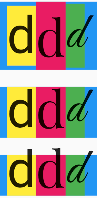
The following picture illustrates the variations you can observe, using different fonts, setting the very same fontSize. Each row of that picture gives the outcome defining the height as follows:
row 1: height is not defined
the TextSpan height corresponds to the "font metrics default height"
row 2: height is 1
the TextSpan height corresponds to exactly 1.0 * fontSize
row 3: height is 0.8
the TextSpan height corresponds to exactly 0.8 * fontSize
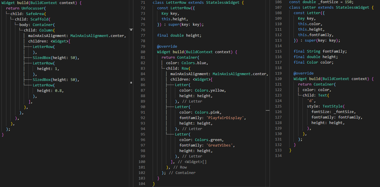
The code to produce this is the following:
This image illustrates quite well the notions I tried to explain here above:
- each font has a different box height, even using the same fontSize parameter;
- each font has a different baseline. None of the letters are "touching" the same horizontal line
This leads to the following initial conclusion:
The use of several fonts might lead to inconsistent alignments and a lack of harmony of the layout.
Notion of TextTheme
Flutter defines a series of typographical text styles that are referenced by the different Widgets that use the notion of Text.
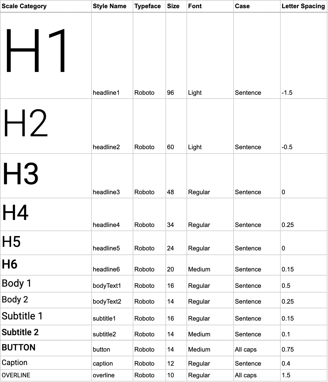
These text styles (Typography 2018) are the following:
| English-like | Chinese, Japanese, Korean | Arabic, Farsi, Hindi, Thai | |||||
|---|---|---|---|---|---|---|---|
| Name | Size | Weight | LS | Size | Weight | Size | Weight |
| headline1 | 96 | w300 | -1.5 | 96 | w100 | 96 | w400 |
| headline2 | 60 | w300 | -0.5 | 60 | w400 | 60 | w400 |
| headline3 | 48 | w400 | 0.0 | 48 | w400 | 48 | w400 |
| headline4 | 34 | w400 | 0.25 | 34 | w400 | 34 | w400 |
| headline5 | 24 | w400 | 0.0 | 24 | w400 | 24 | w400 |
| headline6 | 20 | w500 | 0.15 | 21 | w500 | 21 | w700 |
| subtitle1 | 16 | w400 | 0.15 | 17 | w400 | 17 | w400 |
| subtitle2 | 14 | w500 | 0.10 | 15 | w500 | 15 | w500 |
| bodyText1 | 16 | w400 | 0.5 | 17 | w400 | 17 | w700 |
| bodyText2 | 14 | w400 | 0.25 | 15 | w400 | 15 | w400 |
| button | 14 | w500 | 0.75 | 15 | w500 | 15 | w700 |
| caption | 12 | w400 | 0.4 | 13 | w400 | 13 | w400 |
| overline | 10 | w400 | 1.5 | 11 | w400 | 11 | w400 |
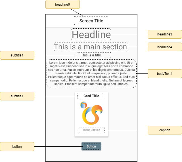
The following picture gives you an overview of these text styles for "English-like".
Side note
As of version 1.13.8 of Flutter, the names that were used in the 2014 version of the Material Design, were deprecated. This explains why you might notice a lot of warnings with some previous code.
So far, the old naming still works as an internal mapping is ensured, but I would recommend that you move to the new namings as soon as possible.
However, the default typography which is used when initializing the ThemeData is still 2014 ?!? I suppose this will be fixed shortly.
Besides the physical characteristics of the glyphs (fontSize, fontWeight, letterSpacing), we also need to consider the default colors, which are defined based on the platform type and brightness. The following table gives the "names" of the corresponding standards:
| Platform | iOS / macOS | Android / Fuchsia | Windows | Linux | |
|---|---|---|---|---|---|
| Brightness | light | Cupertino | MountainView | Redmond | Helsinki |
| dark | |||||
The following table gives the corresponding default colors and font families:
| Styles | Brightness | fontFamily | ||||
|---|---|---|---|---|---|---|
| Dark | Light | Cupertino | MountainView | Redmond | Helsinki | |
| headline1 | black54 | white70 | .SF UI Display | Roboto | Segoe UI | Roboto |
| headline2 | black54 | white70 | ||||
| headline3 | black54 | white70 | ||||
| headline4 | black54 | white70 | ||||
| headline5 | black87 | white | ||||
| headline6 | black87 | white | ||||
| subtitle1 | black87 | white | .SF UI Text | |||
| subtitle2 | black | white | ||||
| bodyText1 | black87 | white | ||||
| bodyText2 | black87 | white | ||||
| button | black87 | white | ||||
| caption | black | white70 | ||||
| overline | black54 | white | ||||
When to use them?
Here is a short summary of the recommendations made by Material Design.
Headlines
There are 6 headlines (headline1 to headline6) and they are the largest text to put on the screen.
They should be reserved for short and important texts such as:
- titles
- numerals
Subtitles
There are 2 subtitles (subtitle1 and subtitle2) and are smaller than headlines.
They should be reserved for medium-emphasis texts but still relatively short texts.
BodyText
There are 2 body types (bodyText1 and bodyText2). They are smaller than subtitles and should typically be used for longer texts, such as description.
Caption & Overline
Caption and overline (text with a line above it) are the smallest font sizes.
They should be reserved to annotate imagery or to introduce a headline.
Button
Button text should be reserved for a call to actions, such as:
- button
- tabs
- navigation bars
The following picture shows an example:
How does Flutter compose its TextThemes?
Please be reassured, I will not go into all the details this time but, will remain focused on the main aspects.
When you start your application, everything begins as soon as you define the MaterialApp.
The most important parameters related to the theme that can be defined at the level of the MaterialApp widget are:
theme
Defines the (usually) light theme definition.
themeDark
Often forgotten but available, defines a second theme to provide a dark version of the user interface. This themeDark can also be used for platforms that allow the user to select a system-wide 'dark mode'.
themeMode
This parameter determines which of the 2 themes to use [default: ThemeMode.system]. This means that the theme to be used will depend on the user settings.
However, it is possible to force the theme, independently of the user settings, forcing it to ThemeMode.light or ThemeMode.dark.
fontFamily
This parameter defines the default fontFamily to be used, if omitted in any definition.
typography
This parameter (default: Typography.material2014) is used as a reference to define the textTheme, primaryTextTheme and accentTextTheme.
locale & localizationsDelegates
Usually forgotten in terms of impact on the textTheme(s), these parameters are very important as they define variations in terms of baseline, fontSize, fontWeight (see later).
How does Flutter determine the 'theme' to use?
Here is the extract of the source code (I just changed the last line to ease the reading), where widget refers to the MaterialApp instance:
final ThemeMode mode = widget.themeMode ?? ThemeMode.system;
ThemeData? theme;

if (widget.darkTheme != null) {
  final ui.Brightness platformBrightness = MediaQuery.platformBrightnessOf(context);
  if (mode == ThemeMode.dark ||
      (mode == ThemeMode.system && platformBrightness == ui.Brightness.dark)) {
    theme = widget.darkTheme;
  }
}

theme ??= widget.theme ?? ThemeData(brightness: Brightness.light);
So, Flutter invokes the ThemeData factory which initializes some textStyles:
3 main TextTheme:
- textTheme
- primaryTextTheme
- accentTextTheme
19 indirect ones:
| Name | default |
|---|---|
| toggleButtonsTheme.textStyle | textTheme.bodyText2 |
| inputDecorationTheme.labelStyle | textTheme.subtitle1 |
| inputDecorationTheme.helperStyle | textTheme.caption |
| inputDecorationTheme.hintStyle | textTheme.caption |
| inputDecorationTheme.errorStyle | textTheme.caption |
| inputDecorationTheme.prefixStyle | textTheme.caption |
| inputDecorationTheme.suffixStyle | textTheme.caption |
| inputDecorationTheme.counterStyle | textTheme.caption |
| sliderTheme.valueIndicatorTextStyle | textTheme.bodyText1 |
| tabBarTheme.labelStyle | textTheme.bodyText1 |
| tabBarTheme.unselectedLabelStyle | textTheme.bodyText1 |
| tooltipTheme.textStyle | textTheme.bodyText2 |
| chipTheme.labelStyle | textTheme.bodyText1 |
| chipTheme.secondaryLabelStyle | textTheme.bodyText1 |
| navigationRailTheme.unselectedLabelTextStyle | textTheme.bodyText1 |
| navigationRailTheme.selectedLabelTextStyle | textTheme.bodyText1 |
| snackBarTheme.contentTextStyle | textTheme.subtitle1 |
| popupMenuTheme.textStyle | textTheme.subtitle1 |
| bannerTheme.contentTextStyle | textTheme.bodyText2 |
The 'cupertinoOverrideTheme' is a special one that is aimed at overwriting when using the Cupertino Widgets.
Wow! So many TextStyles...
What is the difference between 'textTheme', 'primaryTextTheme' and 'accentTextTheme'?
When considering the default definition, there is no differences in terms of fontSize, fontFamily, height, fontWeight, letterSpacing, decoration...
Differences could be set when there is a need that the text contrasts with its container. Most of the time, this will be limited to the notion of colors.
Where are they used by the different Flutter Framework Widgets?
Some time ago, in order to better understand how and when these pre-defined TextStyles were used by the Flutter Framework, I started up reading the whole source code and made the inventory. Here is my personal Excel Cheat Sheet that gives a summary of the way TextStyles are used by the main Flutter Widgets (version 1.17):
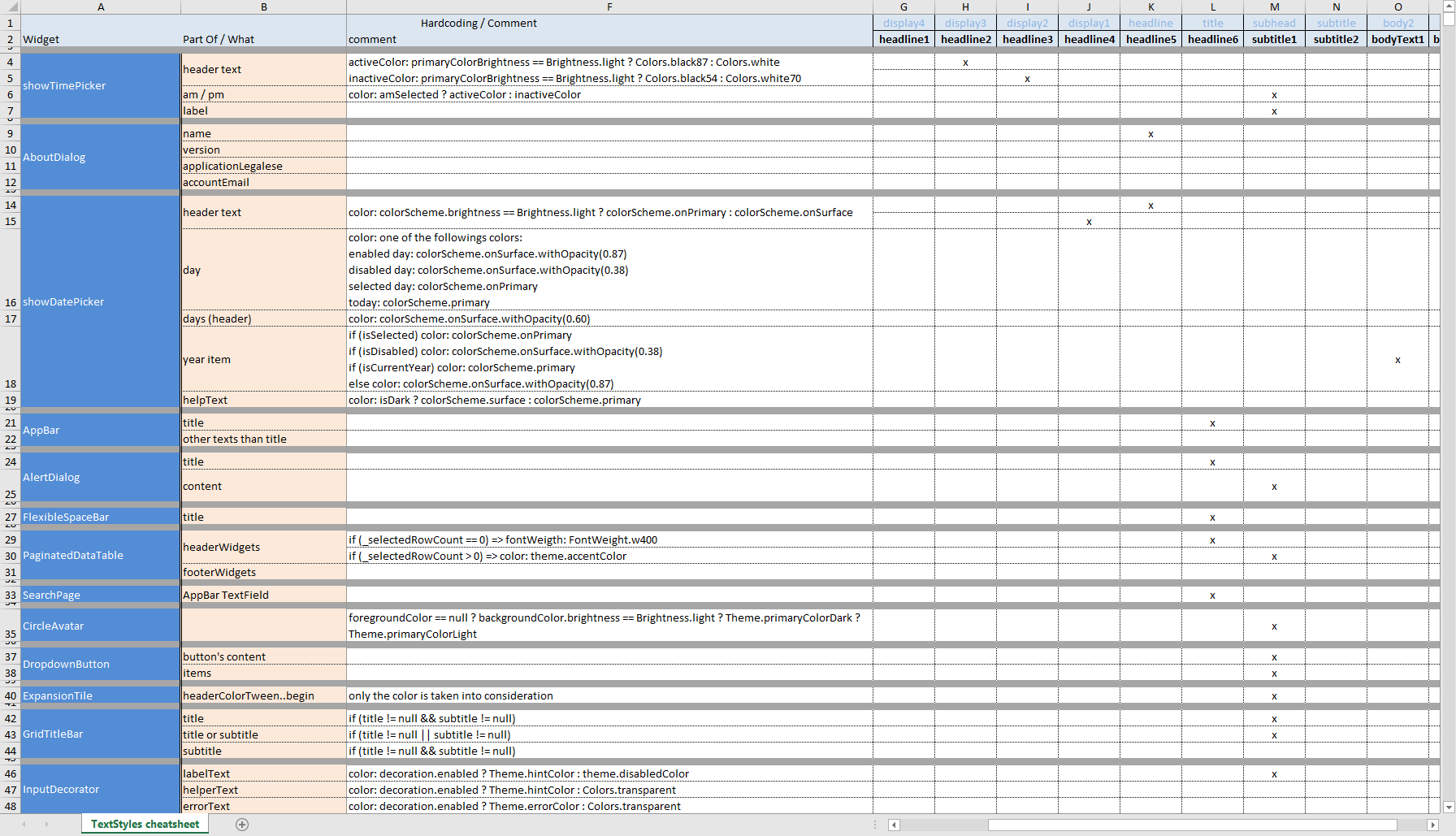
At a glance, we directly see that headline1 is never used, headline(2-5) are only used by the Dialogs (TimePicker, DatePicker, About...) and the most used ones are headline6 (former: title), subtitle1, bodyText1, bodyText2, caption and of course, button.
Warning... hardcoded values or rules...
Despite the fact that the Flutter team tried as much as possible to leave full freedom to the developers to define their own themes, the current Flutter Framework source code, unfortunately, still contains a couple of hardcoded values and rules. I tried to list them up in the Excel spreadsheet.
What about the user-defined Text Theme(s)?
So far, we have seen the principles of the TextTheme as defined by Flutter, based on the Material Design standard. Does this mean that we may not apply any changes?
Not at all. However, based on the way the text themes are used across all Flutter Framework Widgets, it is becoming obvious that:
If you want to harmonize your layout, you should also use as much as possible the following style names inside your code:
- headline6
- subtitle1
- subtitle2
- bodyText1
- bodyText2
- caption
- button
Therefore, how can we define our own TextStyles without breaking the rules and harmony?
Rule 1: Be aware of the impacts...
When you define your application theme, be aware that your definition will be used by other Widgets!
For example, if set the textTheme.subtitle1, you have to remember that this will potentially impact the following Widgets:
- TimePicker
- AlertDialog
- PaginatedDataTable
- CircleAvatar
- DropdownButton
- ExpansionTile
- GridTitleBar
- InputDecorator
- ListTile
- PopupMenu
- SnackBar
- TextField
- TextFormField
- ...and all derived Widgets !
This is where my Excel Cheatsheet might be useful!
Rule 2: Use the Theme.of(context) in your Widgets
When you define your own Widgets, do not forget to use the theme.of(context) to reference an existing textStyle.
For example, suppose that you are building a new Cartouche Widget which needs to display a title, a picture and a label.
A bad practice would be to write it without considering the existing styles and to write it like this:
1
2class Cartouche extends StatelessWidget {
3 const Cartouche({
4 super.key,
5 required this.title,
6 required this.caption,
7 required this.assetImage,
8 required this.size,
9 this.padding = const EdgeInsets.all(8.0),
10 });
11
12 final String title;
13 final String caption;
14 final String assetImage;
15 final Size size;
16 final EdgeInsets padding;
17
18
19 Widget build(BuildContext context) {
20 return Card(
21 child: Container(
22 width: size.width,
23 height: size.height,
24 padding: padding,
25 child: Column(
26 crossAxisAlignment: CrossAxisAlignment.center,
27 children: <Widget>[
28 Text(
29 title,
30 textAlign: TextAlign.center,
31 style: TextStyle(
32 fontSize: 16.0,
33 fontWeight: FontWeight.bold,
34 letterSpacing: 0.15,
35 ),
36 ),
37 Container(width: size.width - padding.horizontal * 2.0, child: Image.asset(assetImage)),
38 Text(
39 caption,
40 textAlign: TextAlign.center,
41 style: TextStyle(fontSize: 10.0, letterSpacing: 0.4),
42 ),
43 ],
44 ),
45 ),
46 );
47 }
48}
49A better approach would be to re-use the existing definition as follows:
1
2class Cartouche extends StatelessWidget {
3 const Cartouche({
4 super.key,
5 required this.title,
6 required this.caption,
7 required this.assetImage,
8 required this.size,
9 this.padding = const EdgeInsets.all(8.0),
10 });
11
12 final String title;
13 final String caption;
14 final String assetImage;
15 final Size size;
16 final EdgeInsets padding;
17
18
19 Widget build(BuildContext context) {
20
21 final TextTheme textTheme = Theme.of(context).textTheme;
22
23 return Card(
24 child: Container(
25 width: size.width,
26 height: size.height,
27 padding: padding,
28 child: Column(
29 crossAxisAlignment: CrossAxisAlignment.center,
30 children: <Widget>[
31 Text(
32 title,
33 textAlign: TextAlign.center,
34 style: textTheme.subtitle1.copyWith(fontWeight: FontWeight.bold),
35 ),
36 Container(width: size.width - padding.horizontal * 2.0, child: Image.asset(assetImage)),
37 Text(
38 caption,
39 textAlign: TextAlign.center,
40 style: textTheme.caption,
41 ),
42 ],
43 ),
44 ),
45 );
46 }
47}
48Explanation:
- line #21: we retrieve the current TextTheme
- line #34: we use the regular subtitle1 theme and we force it to bold
- line #40: we use the regular caption theme
This ensures that if you change the theme definition at a later stage, you will keep the harmony.
Rule 3: Consider creating a dedicated Theme for a new package
Let's suppose that you want to create a new package (let's say a new RadialMenu).
As the latter will (most certainly) not be part of the regular Flutter Framework and might require very specific layout settings, it might be a very good idea to create a specific theme for this package. This will give the possibility to developers to customize it, without taking any risks of impacting the others.
Of course, it will be highly recommended to consider fallback values, based on the Material Design standards.
As an example, you could write something like:
class RadialMenuTheme extends InheritedTheme {
  const RadialMenuTheme({
    Key? key,
    required this.data,
    required Widget child,
  }) : super(key: key, child: child);

  final RadialMenuThemeData data;

  ...
}

class RadialMenuThemeData {
  const RadialMenuThemeData({
    this.menuTextStyle,
    ...
  });

  final TextStyle menuTextStyle;
  ...
}
Then to use it (and let's make the assumption that the developer will apply whatever style to it):
Widget build(BuildContext context){
return RadialMenuTheme(
data: RadialMenuThemeData(
menuTextStyle: TextStyle(fontWeight: FontWeight.w500),
),
child: RadialMenu(
menuColor: Colors.red,
),
);
}
And, at rendering time, at the level of the RadialMenu build(), you might consider something like:
Widget build(BuildContext context){
final ThemeData theme = Theme.of(context);
final RadialMenuThemeData radialMenuThemeData = RadialMenuTheme.of(context) ?? RadialMenuThemeData();
TextStyle menuTextStyle = radialMenuThemeData.menuTextStyle ?? theme.textStyle.subtitle1;
if (widget.menuColor != null){
menuTextStyle = menuTextStyle.copyWith(color: widget.menuColor);
}
...
}
Of course, this is not a full example but I hope it gives you an idea of a way of handling the themes.
What about the TextStyle() class?
Does this all mean that you should proscribe the use of the TextStyle class?
Not at all but, as a recommendation, I would suggest to:
try to refrain yourself from using TextStyle in an anarchical way.
try to limit its use to the definition of
- colors
- decoration
- weight
try to avoid hardcoding
- fontSize
- fontFamily
- letterSpacing
Is it possible to extend the ThemeData ?
As the ThemeData is part of the formal classes of the Flutter Framework, it is only managed by the Flutter Team and therefore, it is not allowed but nothing prevents you from creating your own ApplicationExtendedTheme, which could then contain whatever you want!
Where should it be located?
The Theme widget is a child of your MaterialApp and because the theme definition also depends on the locale (remember? the textStyles are not the same for Farsi, Arabic, English...), but also because it would be great to base your ApplicationExtendedTheme on the ThemeData definition, it is better to also have it inside the MaterialApp subtree.
MaterialApp Widget has a very convenient builder property that could be used for this purpose. The signature of this function is:
Widget Function(BuildContext context, Widget child)
The child argument corresponds to whatever needs to be rendered underneath (typically your screens).
So we now know where to put our ApplicationExtendedTheme widget.
How to build it?
As the objective is to make it available to all widgets of your application, it would be great to be able to retrieve it, using the usual "of(context)" statement.
Part 1: The ApplicationExtendedTheme Widget
Therefore, we will build it as a StatelessWidget, which will contain an InheritedTheme to hold the theme extra definition.
class ApplicationExtendedTheme extends StatelessWidget {
const ApplicationExtendedTheme({
super.key,
required this.child,
this.data,
});
final ApplicationExtendedThemeData? data;
final Widget child;
static ApplicationExtendedThemeData? of(BuildContext context) {
final _InheritedTheme? inheritedTheme = context.dependOnInheritedWidgetOfExactType<_InheritedTheme>();
return inheritedTheme?.theme.data ?? ApplicationExtendedThemeData.fromContext(context);
}
Widget build(BuildContext context) {
return _InheritedTheme(
theme: this,
child: child,
);
}
}
Explanation:
As we can see, this Widget allows storing the definition of the ApplicationExtendedThemeData if provided.
The of function returns it (if available) or requests its composition based on the BuildContent if none could be found.
Part 2: The underlying InheritedTheme Widget
The second internal Widget is there to hold the ApplicationExtendedThemeData for later re-use or to request (and then store) the data to be produced, if not existing or different.
class _InheritedTheme extends InheritedTheme {
const _InheritedTheme({
Key? key,
required this.theme,
required Widget child,
}) : super(key: key, child: child);
final ApplicationExtendedTheme theme;
Widget wrap(BuildContext context, Widget child) {
final _InheritedTheme? ancestorTheme = context.findAncestorWidgetOfExactType<_InheritedTheme>();
return identical(this, ancestorTheme) ? child : ApplicationExtendedTheme(data: theme.data, child: child);
}
bool updateShouldNotify(_InheritedTheme old) => theme.data != old.theme.data;
}
Part 3: The ApplicationExtendedThemeData class
Here is an example of such a class, which generates 2 fake text styles.
class ApplicationExtendedThemeData with Diagnosticable {
ApplicationExtendedThemeData();
//
// Style spécial pour les boutons qui sont
// désactivés et présents dans un AppBar
//
late TextStyle appBarDisabledButtonTextStyle;
//
// Style spécial pour les messages où
// l'utilisateur est invité à prendre
// une décision importante
late TextStyle userImportantDecisionMessageTextStyle;
//
// Construis les Themes sur base des thèmes déjà définis
//
factory ApplicationExtendedThemeData.fromContext(BuildContext context) {
final ThemeData themeData = Theme.of(context);
final ApplicationExtendedThemeData theme = ApplicationExtendedThemeData();
//
// (Exemple) Définition du style du buton
//
theme.appBarDisabledButtonTextStyle = themeData.textTheme.button!
.copyWith(
fontStyle: FontStyle.italic,
)
.apply(
decoration: TextDecoration.lineThrough,
fontSizeFactor: 0.8,
);
//
// (Exemple) Définition du style du message
//
theme.userImportantDecisionMessageTextStyle = themeData.primaryTextTheme.bodyText1!
.copyWith(
fontWeight: FontWeight.w800,
)
.apply(
fontSizeFactor: 1.2,
decoration: TextDecoration.underline,
);
return theme;
}
bool operator ==(Object other) {
if (other.runtimeType != runtimeType) {
return false;
}
return other is ApplicationExtendedThemeData &&
other.appBarDisabledButtonTextStyle == appBarDisabledButtonTextStyle &&
other.userImportantDecisionMessageTextStyle == userImportantDecisionMessageTextStyle;
}
int get hashCode => Object.hashAll([
appBarDisabledButtonTextStyle,
userImportantDecisionMessageTextStyle,
]);
}
As you can see, these 2 fake styles are based on the existing definition of the general theme and are, therefore, coherent from a layout harmony perspective.
Part 4: Inject the ApplicationExtendedThemeData via the ApplicationExtendedTheme
As previously said, this will be done at the level of the MaterialApp as the following extract shows:
1
2...
3return MaterialApp(
4  title: 'Material Design Text demo',
5
6  //
7  // Theme
8  //
9  theme: ThemeData(
10    // définition du Theme général
11  ),
12
13  //
14  // Insère le ApplicationExtendedTheme
15  //
16  builder: (BuildContext context, Widget? child){
17    return ApplicationExtendedTheme(
18      child: child!,
19    );
20  },
21
22  //
23  // Page de démarrage
24  //
25  home: SplashPage(),
26);
27
Part 5: How to use it?
Finally, the way of using it is very similar to the regular Theme.
Widget build(BuildContext context) {
final ApplicationExtendedThemeData applicationExtendedThemeData
= ApplicationExtendedTheme.of(context)!;
return ElevatedButton(
child: Text(
'Mon beau bouton',
style: applicationExtendedThemeData.appBarDisabledButtonTextStyle,
),
onPressed: (){
...
},
);
}
Really necessary?
Is it really necessary to do all this, will you ask me?
Believe me, if you need to develop a huge project and get back to it after quite some time, the fact of having all the Application Extended Themes in one single location will greatly help you.
The example I gave here above is very basic and limited to 2 fake TextStyles. In practice, I also sometimes define Application Specific Themes and I embed them to the ApplicationExtendedThemeData class and this is very convenient!
Conclusions
I really hope that this quick tour of the notion of TextStyle through the use of the Theme gives you an idea of the importance of using the notion of themes and also demystified it.
The ApplicationExtendedThemeData is a personal way I found to centrally manage the application styles and make them coherent with the theme definitions. It helps me reduce drastically the uncontrolled styles and, forces me to have them all defined in the same file. There are other ways of doing it, but this is the one I personally use.
Stay tuned for new articles, shortly and, as usual, happy coding!